30
May 13

Client Spotlight – Susan Kaplow

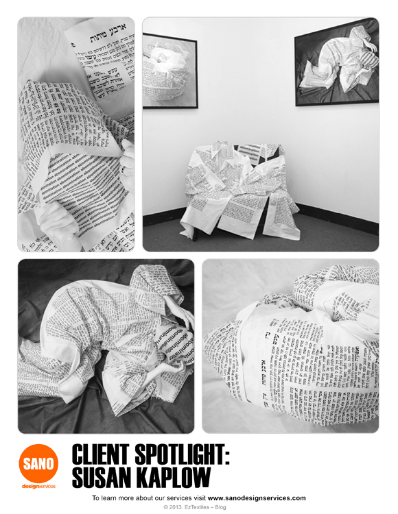
Artist Susan Kaplow has had an interesting journey through life, and we’re pleased to share her current exhibit Abomination: Wrestling with Leviticus 18:22. We helped her print the fabric she used in the images below, exploring how certain passages in the Bible have affected her.  You can see her works now through June 28th at Hebrew Union College – JIR Museum or by visiting her website.

SUSAN KAPLOW

Share this Post!

19
Oct 11

Prints – Paris Fashion Week Spring 2012

Paris Fashion Week may be over, but we’ve still got a twinkle in our eye about the prints we saw!  As much as Milan Fashion Week showcased color, Paris focused more on neutral collections with pop prints sprinkled here and there.  Whether they be photographic, graphic or ditsy florals, designers throughout Paris’ Fashion week used black and white as staple colors.

Check out our favorites below and compare to our other posts on Milan, London & New York!

Images via Vogue.co.uk


15
Jul 11

Prints – French Dressings

Bastille Day was July 14th, and to honor the day we couldn’t resist using this style.com image for a Parisian inspired post!

The French Riviera evokes a sophisticated,cool chic style. The long, loose jumpsuit is a perfect silhouette for the bold black and white geometric inspired print. We went into our vast library of prints on EzTextiles.com and decided to infuse a tribal feel and tweak the color a bit using blue hues of the ocean which always emits a summer vibe.

See our Riviera inspired board and then see what inspires you!


via Style.com


14
Apr 11

On the Street- Go Graphic

We LOVE streetlooks, especially when there are strong prints or graphics involved! Check out the black+white focus on a perfect pair of skinny pants!

Love graphic elements? Get inspired by our mini-collection based on this trend!

via Art is my Hustle

via Art is my Hustle


24
Feb 11

Prints – Graphic Grayscale

As designers, sometimes we have to get a little graphic…and using black and white elements are a great way to get that point across!

We were instantly inspired by Pierre Dal Corso’s recent photography spread, and the optical, and graphic quality that he expressed through wardrobe styling.

Check out our trend interpretation below and download these images + more..

Pierre Dal Corso


09
Feb 11

Interiors – Neutral Territory

Spring is just around the corner and we are so excited for the neutral color tones that designers are using to create sophisticated palettes.

Check out Kelly Wearstler’s Vibe Tray below, from her personal blog. We used the extensive EzTextiles library to design an entire collection with the same mood and mixed patterns technique in mind.  Use your design skills to start a collection now!

Check out the rest of our interiors inspired collection!

via TheGlamourai